Brown VS. Grey

IMG_0531.JPG

Whenever I meet with clients, the first thing I’ll ask them is this: “Do you prefer brown or grey?”. I find that nearly all projects need a neutral colour that works as a general backdrop. This colour will steer the direction of their design concept. Everyone tends to gravitate towards one neutral more than the other. Selecting a neutral doesn’t mean we won’t use other colours in the space, it just means the design will have a neutral tone to anchor the overall look.


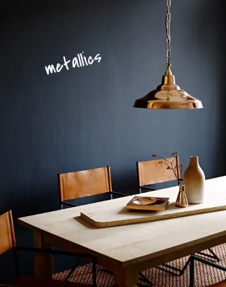
Brown versus grey is a constant ongoing debate in the design world. Fans of brown find it’s warmth inviting, but it often gets a bad rap by those who label it as dull or boring. Brown gives a natural quality and adds a human touch not found in colder colours. Although it can come off as being traditional, ultimately brown pairs incredibly well with stronger, saturated colours creating a gorgeous colourful space. 
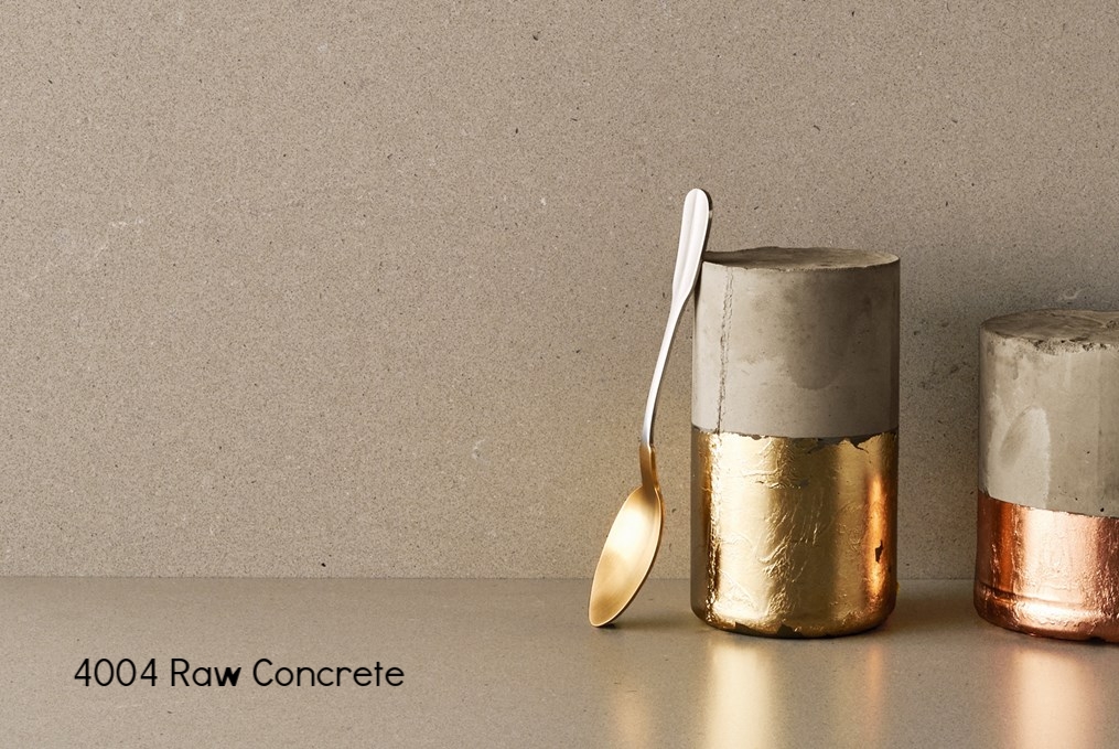
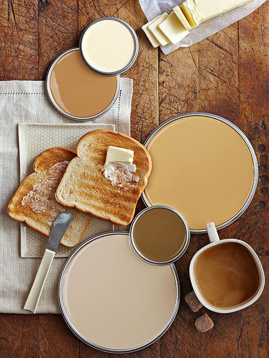
BROWNS


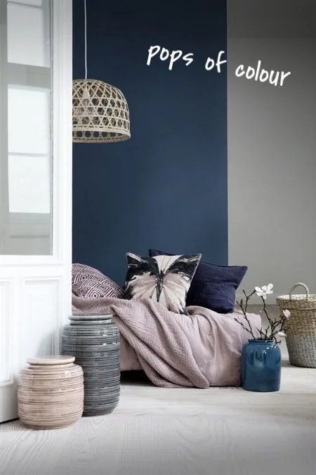
Grey lovers desire the simplicity of a colourless colour. There is always a fear that if you pick grey your space will translate as cold or dreary - but I want to emphasize that not all greys are cold! Greys come in so many different tones and I can guarantee that there are plenty of shades out there that can warm up your space! And of course, the best thing about grey is that it pairs well with anything – and by anything, I mean ANYTHING. It is truly the most neutral hue possible!

GREYS

People’s preference for brown or grey tends to trump trends but one is always more trendier than the other, depending on time and place. But no matter which one is most popular at the time, brown and grey will always outlast any design trend!

So which one do you choose? I’d love to know what your preference is! Take a look at the pictures and comment below!

-MW


Want to work with Meghan? Email her at meghanwinsordesign@gmail.com!

Follow

Neutral Navy

Navy is known as being the darkest blue and it gets its name from the uniforms of the British Royal Navy. It’s a wonderfully versatile colour that works in every style of décor. Because of this, it’s getting a reputation for being a new version of neutral. Whether you incorporate navy with bold patterns or as a background dancer for metallics and bright colours, it will always be there to elevate your design!

Here are some great ways to use navy in your décor:


1. PATTERN: Draw attention with exciting patterns! Use funky wallpaper, throw pillows, rugs, or linens to bring a touch of life to your space!


2. TEXTURE: Use different types of navy fabrics to give the feeling of luxury and elegance.


3. METALLICS: Metallic colours look amazing when paired with navy blue. They add glamour and sophistication to any room.


4. POPS OF COLOUR: Use navy as a beautiful backdrop to anchor your look and add pops of vibrant hues to make the space feel fun and playful. Blankets, pillows, paintings, and lighting are great way to bring in exciting colour!

5. WHITE: When it comes to navy, white can be your best friend. Why not pair a classic neutral with a new upcoming neutral? If you're looking for a beautiful clean, crisp, nautical look, pair white and navy together!


-MW


Want to work with Meghan? Email her at meghanwinsordesign@gmail.com!

Follow

Quartz Countertops

4 Reasons Why I Love Quartz Countertops:

1. STRENGTH: Quartz has the same durability as concrete or granite so it doesn't chip or crack easily.

2. EASY MAINTENANCE: Quartz does not require sealing or other maintenance to maintain its beauty and functionality.

3. COLOUR CONSISTENCY: Quartz is manufactured in a wide range of colours and the colour is consistent throughout the entire slab.

4. CLEANLINESS: Because of its design and manufacturing process, Quartz is a durable and scratch resistant product. It also is non-porous so it does not stain as easily as marble, granite, or concrete. 

Check out these beautiful quartz countertops from Caesarstone!

-MW


Want to work with Meghan? Email her at meghanwinsordesign@gmail.com!

Follow