The World's Ugliest Colour


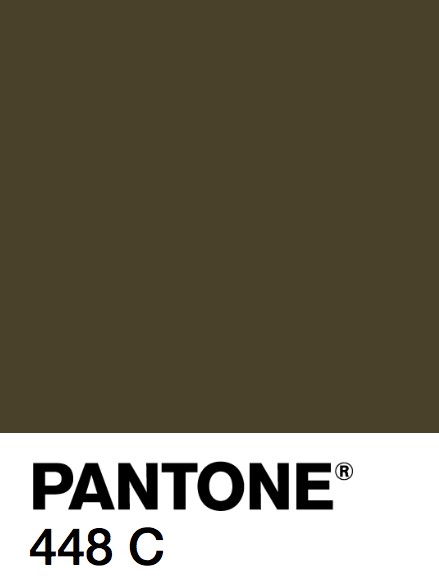
Check out Pantone 448C. Do you like it? Do you hate it?? 


Over the past few months there has been great debate over Pantone 448C or Opaque Couché (as is its official name). This all came about when a research company was tasked to find a colour to put on the Australian government’s plain cigarette packaging to deter people from buying cigarettes. Since this idea has become a big hit, the UK, Ireland, and France are looking at partaking as well.

So is the colour really that bad? Sure, when it’s on a pack of cigarettes it might look vaguely like sludge. But when found in nature, fashion, or interior design, I find it to be pretty darn stunning.

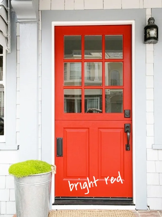
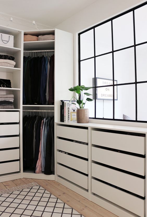
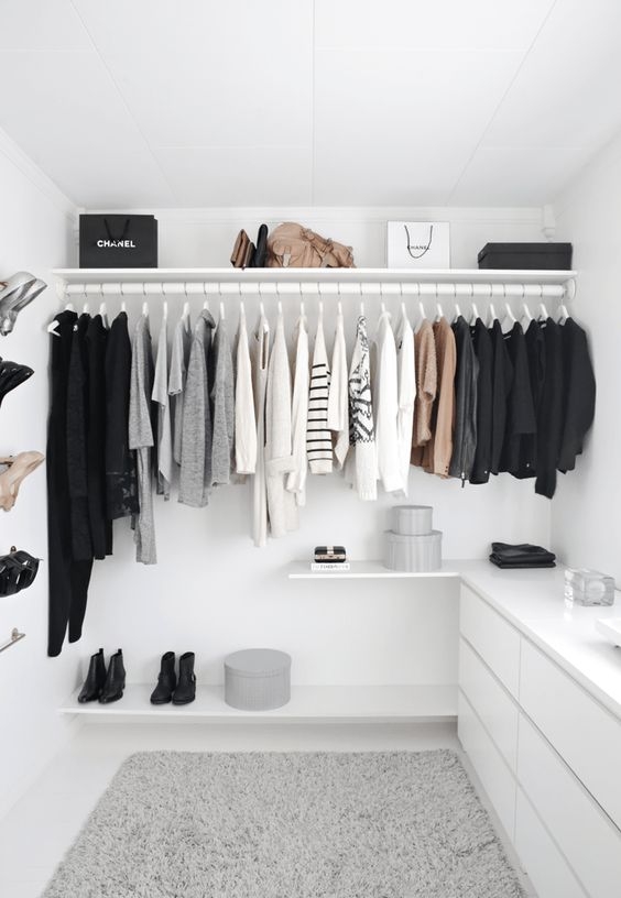
I don’t feel any colour deserves to be labeled “the ugliest” - simply because I believe that every colour has epic amounts of potential. For example, when I look at Pantone 448C, I see a deep, rich, earth tone that would be an awesome colour for a military style jacket, a cute throw pillow, or a dramatic wallpaper.

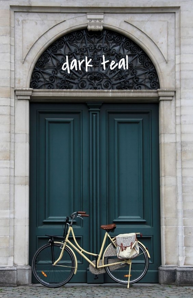
Here are some examples of Pantone 448C out in the world doing its thing. 


Still think it’s ugly?

I don't mind it at all! What do you think?

-Meghan


Click the images to visit the source websites! :)

Want to work with Meghan? Email her at meghanwinsordesign@gmail.com

Colourful Front Doors


I have clients come to me on a regular basis looking for a way to add a punch of colour to their exterior without having to do anything drastic with their siding. One of the most impactful and budget-friendly changes you can make to your home is adding a few coats of paint to your front door! It’s the ideal place to feature a vibrant colour and add interest to the front of your house without competing with the rest of the exterior.

Think of your home’s façade as a blank canvas – this is an invitation to let your personal taste come through! Whether it’s a new bold colour you’ve always loved or a fresh coat of crisp black, a new door colour can have a powerful impact on your home’s overall look.

Having hesitations about that beautiful canary yellow, cherry red, or cobalt blue you’ve always thought about putting on your door? Keep in mind that a door that incorporates a lot of glass can keep an intense shade from being overwhelming. The key to working with bold colours is the limit them to elements you really want to stand out, and let the remaining finishes become the supporting act.

Nothing welcomes guests to your home better than a bold, beautiful color on the front door.

Check out these photos of painted front doors!


Which colour would you choose? Let me know below!

-Meghan


Click the images to visit the source websites! :)

Want to work with Meghan? Email her at meghanwinsordesign@gmail.com!

Closet Love!


Whether your closet is spacious or practically pocket size, there is always a way to make it into a perfectly functioning space that you'll love!


For most people, an amazing closet seems like nothing more than a fantasy - but it really doesn't have to be that way! In the past, bedroom closets were places where clothing was hidden from view. Today, emphasis is on creating a functional, organized closet that can sometimes double as a work space or even a place to hang out!


Check out these great closet designs that I love! Would any of them work for your space?


Which one is your favourite??

-Meghan

Click the images to visit the source websites! :)

Want to work with Meghan? Email her at meghanwinsordesign@gmail.com!