

Complementary Colours
/
We’re going to nerd it up a little here today.
I know everyone has seen a colour wheel before. It’s a pretty well-known diagram developed by Sir Issac Newton. You can use the color wheel diagram to do a number of things, but today I thought I’d give a quick lesson on how to use the color wheel to find complementary colours! Sounds exciting, yes?
There’s three different colour wheel categories: Primary, Secondary, and Tertiary. In order to find our complementary colours, we’re going to use the Secondary Colour Wheel (which is made up of colours formed by mixing our 3 primary colours – red, blue, and yellow.)
Complementary colours are any two hues positioned opposite each other on the colour wheel. When these colours are combined, they cancel each other out (which basically mean they create a grey-scale colour like black or white). When you place complementary colours next to each other they create the strongest contrast for those two particular colours, which pretty much means they look awesome together.
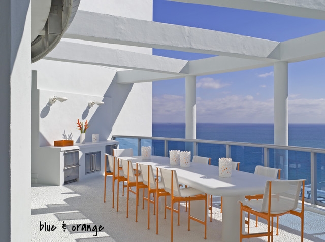
So based on the Secondary Colour Wheel above, yellow complements violet, green complements red, and blue complements orange!
The pictures below give examples of these complementary colours working together to create some awesome looks!


Have you ever used complementary colours to decorate a space? Comment below!
- Meghan
Click the images to visit the source websites! :)
Want to work with Meghan? Email her at meghanwinsordesign.com
